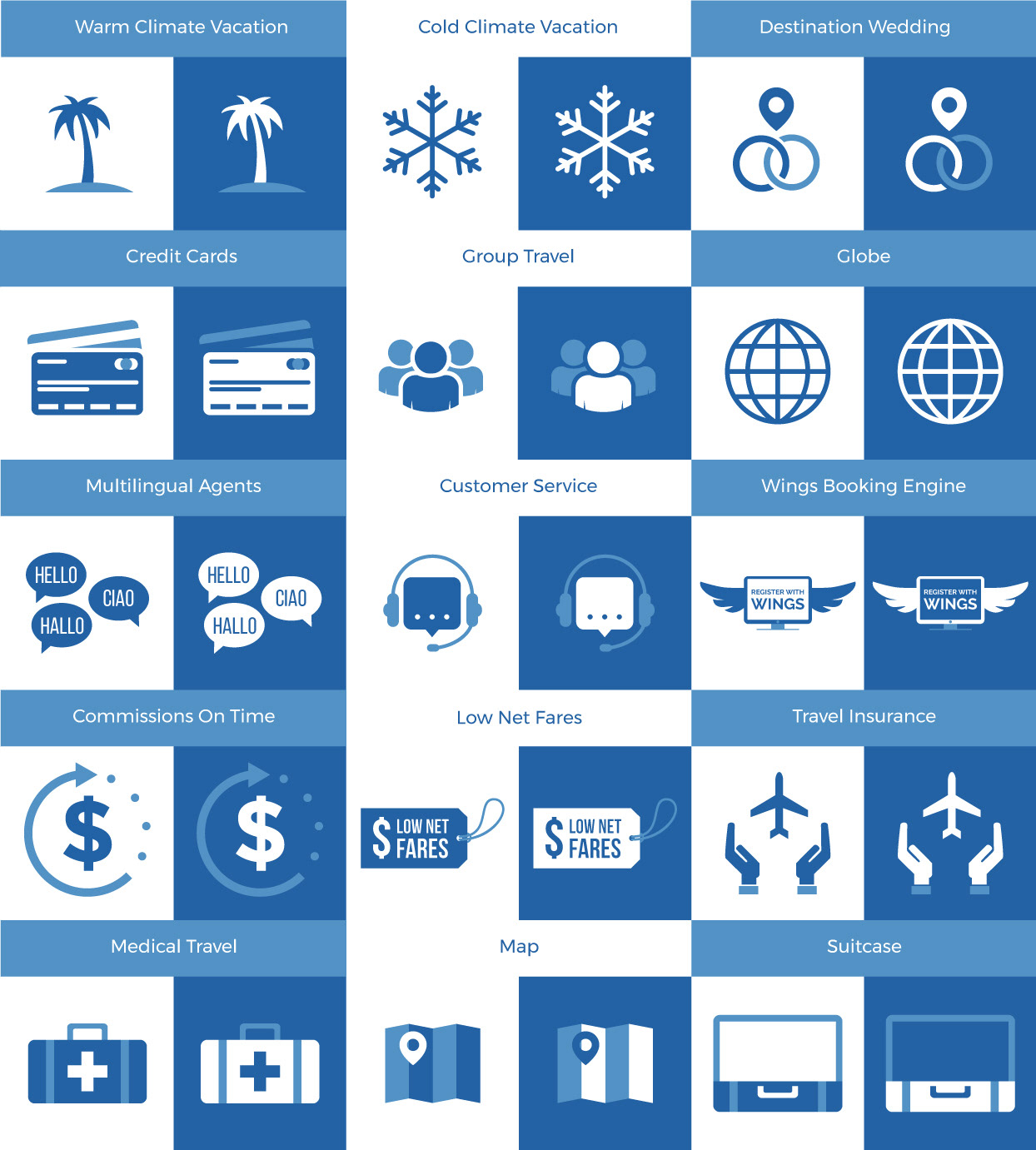
Sky Bird Travel & Tours recently went through a complete rebrand. While working on various projects it became clear that a set of icons would be needed in order to create cohesion across various marketing assets. Together, the marketing team came up with a list of icons that would be useful and I began working on guidelines for the set.

I started with the simplest concepts, developing clear guidelines such as line weight and how the three colors would interact with one another. Once consistencies were settled on, developing the more complex icons became much easier.