Sky Vacation Rebrand
Sky Vacations is a travel company that specializes in tours. While the company has enjoyed moderate success over the years, it was in desperate need of an update to the brand to give it a more modern look and feel.
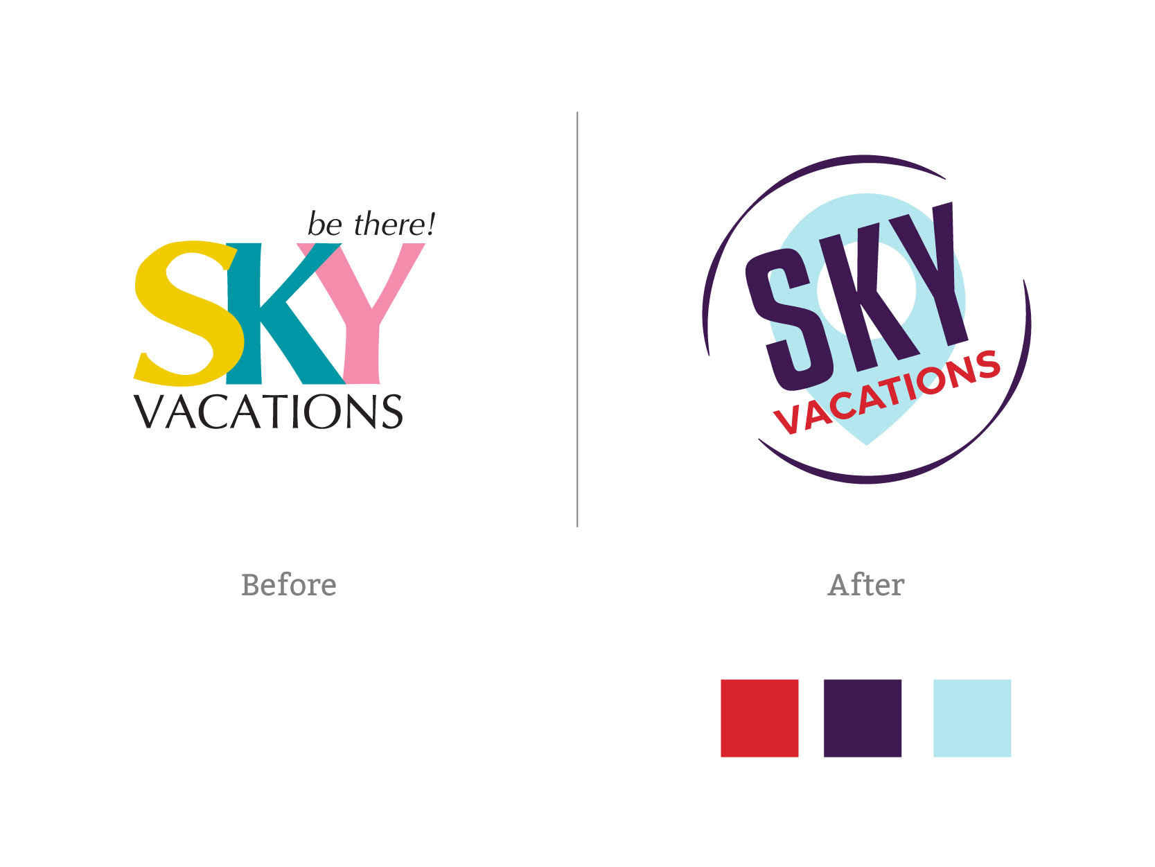
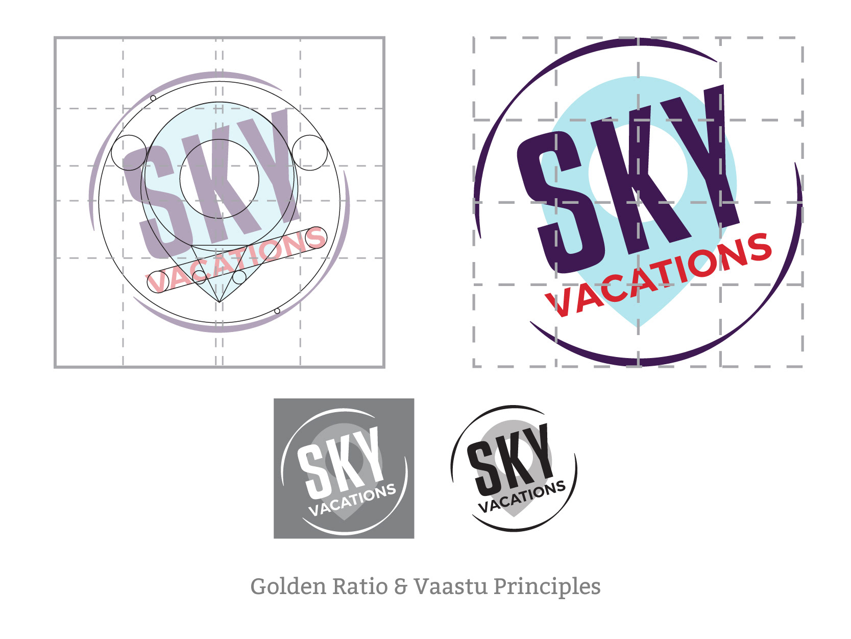
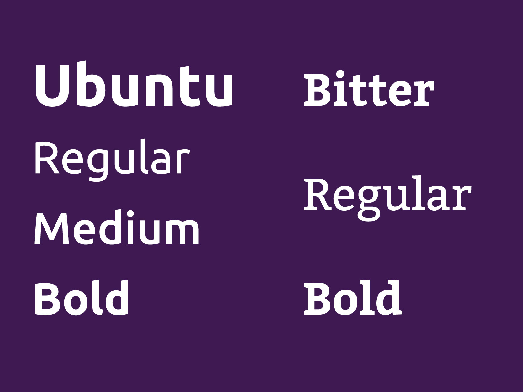
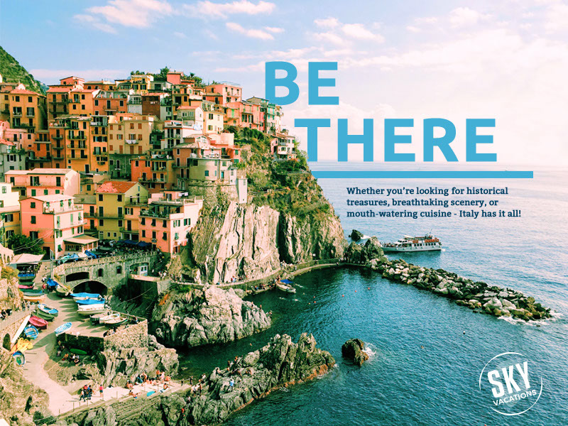
When approaching the Sky Vacations' logo, my main objective was to provide a solution that would give the brand an updated feel while telling new customers what the company was about. A new color palette along with updated fonts would help give the brand a fresh feeling. I’ve translated the ‘be there’ sentiment into a passport stamp with a drop pin to signify that Sky Vacations can take you wherever you want to go for your next vacation.
For colors, I wanted to harness the fierce energy of red with the calm of blue. Both colors are featured within the logo as well as coming together to create the prominent purple which signifies the luxury, ambition, and wisdom that the Sky Vacations brand supplies to its customers.